Flow Farmers Market
Flow Farmers Market branding and visual identity
Flow at Greenwich Peninsula is an ecological farmers market designed to serve as a community hub for enjoying sustainable and high-quality produce and takeaway food. Inspired by its riverside setting, it features local traders offering ethically-sourced goods, from organic meats to fresh baked items.
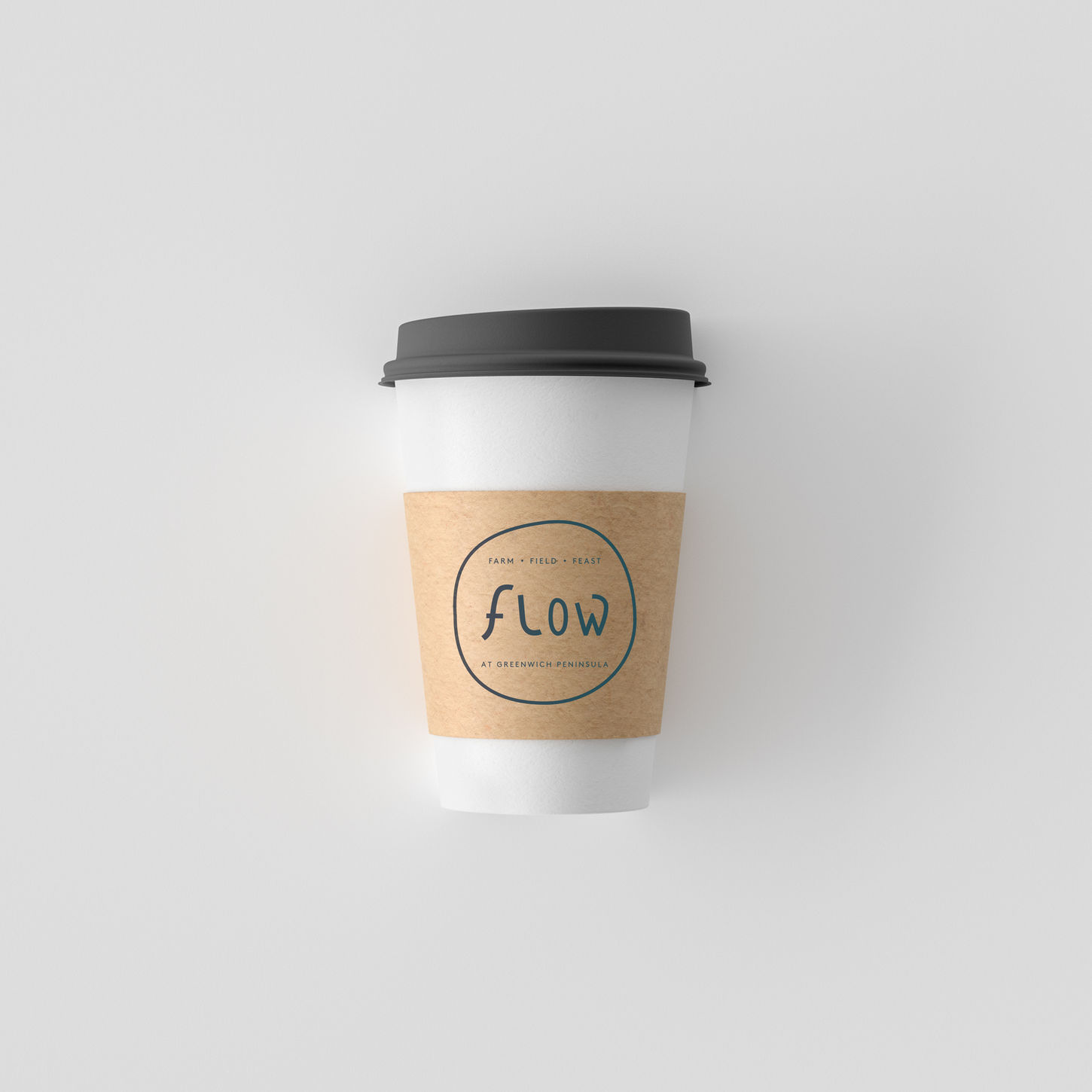
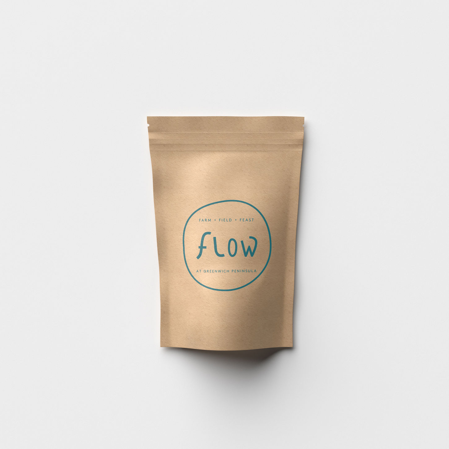
The logo design for FLOW is inspired by the shape of the River Thames, reflecting its riverside location. The overall shape of the logo represents Greenwich Peninsula, with the letters ‘o’ and ‘w’ crafted in an organic, fluid style that complements the theme of flow and water movement.
Client
Greenwich Peninsula
Scope of Work
Branding, and full visual identity, including logo animation, merchandising, website mockup, stationery, social media look and feel, illustrations and photography visual guidelines.
Role
Bibiana Farenzena: Head of Design and graphic designer at Upcircle.


